Projects
Projects
Projects
Projects
Selected
Selected
Selected
Selected
Archive
Archive
Archive
Archive
Archive
Archive
Archive
Archive
Archive
Archive
Archive
Archive
Archive
Archive
Archive
Archive
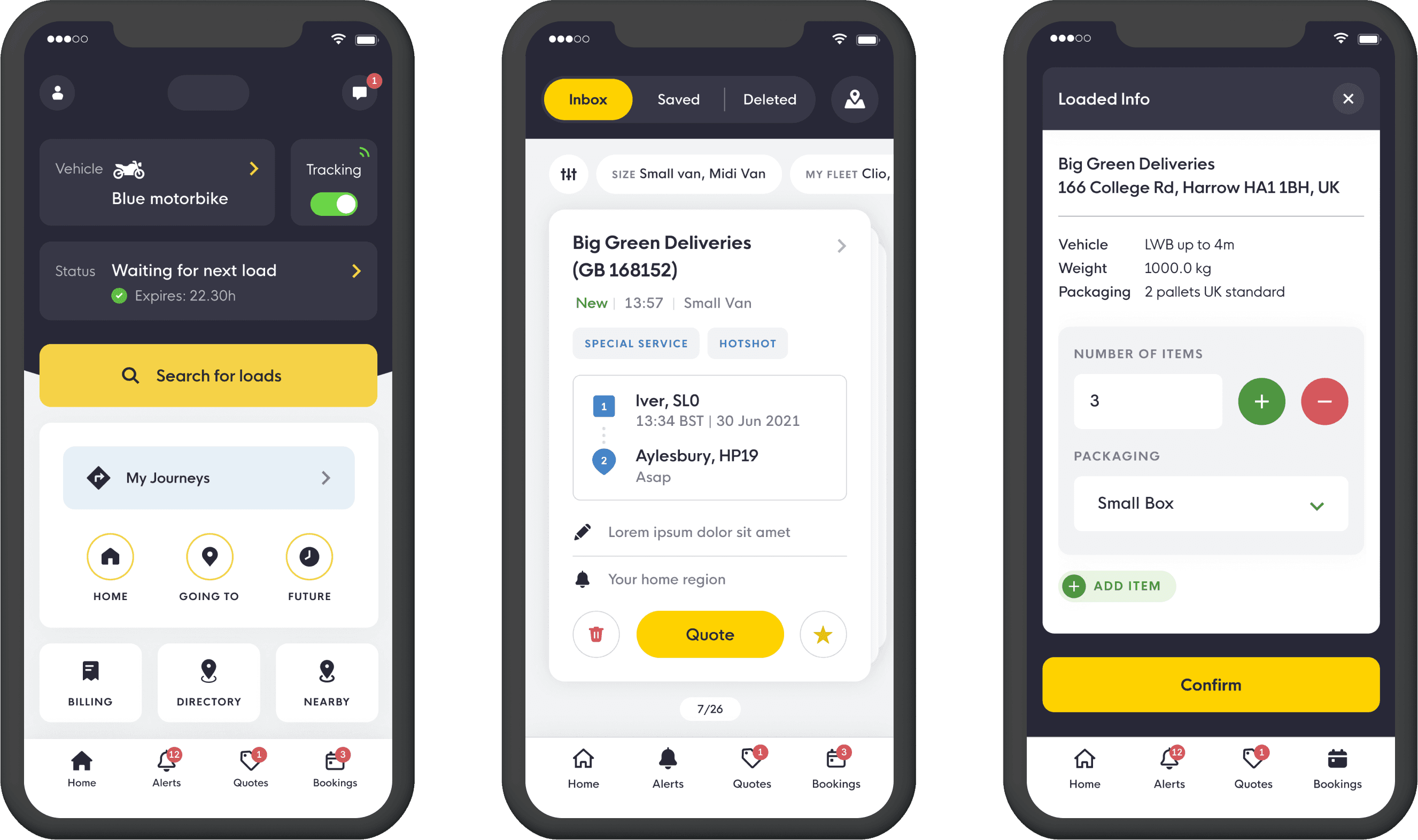
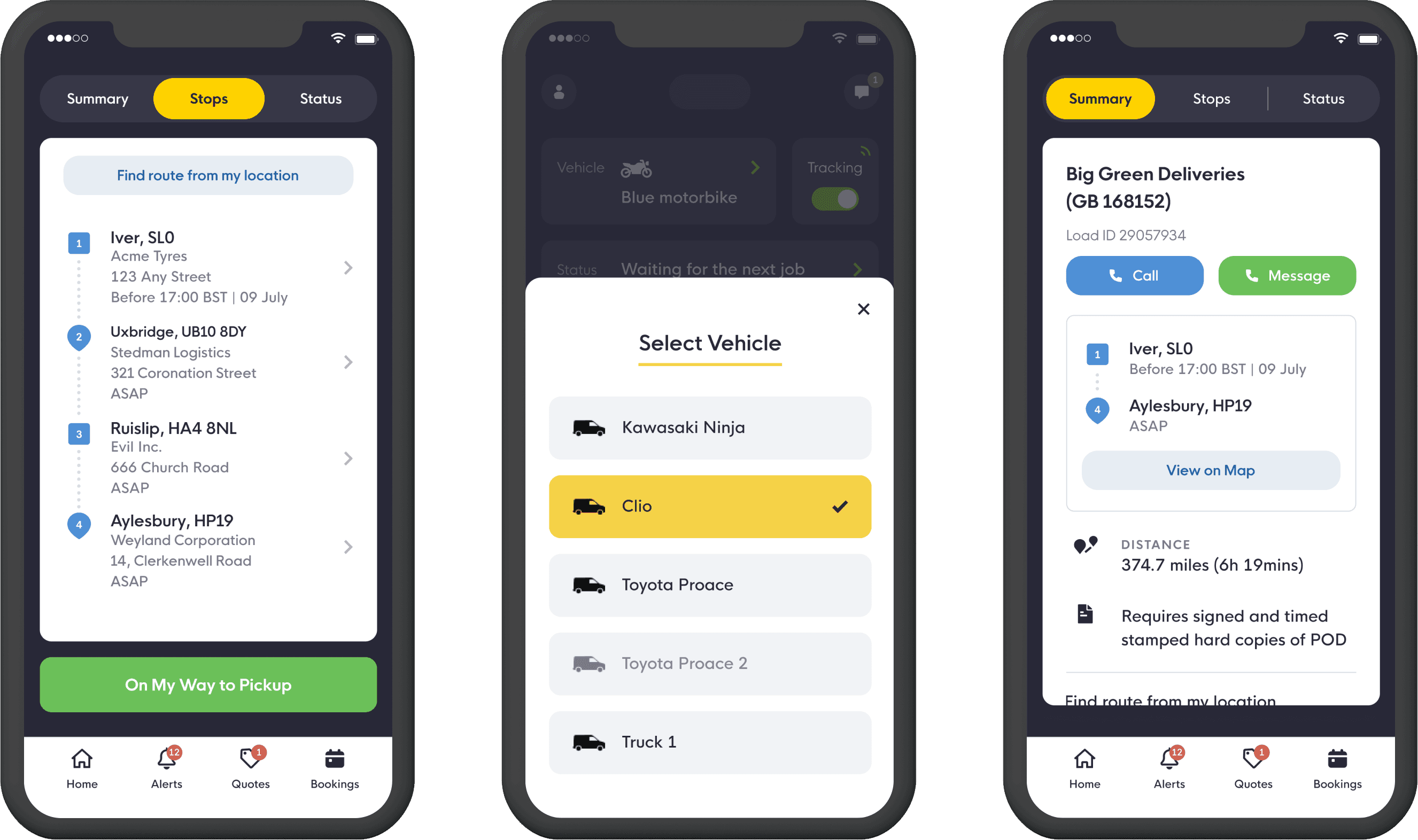
Freight Exchange
Designing for truck drivers meant the UI focused on accessibility, not just through large buttons but also by displaying small amounts of content at a time to minimise scrolling and more.
I had to introduce new UX patterns to improve the experience while keeping the core familiar to a large user base relying on the previous app daily.
After winning the pitch and successfully delivering the product, the happy client asked the agency to work on further projects.
Pitch
discovery
workshops
badget & estimates
user flows
UX & UI
prototype
design systems
2020


Saas & B2B
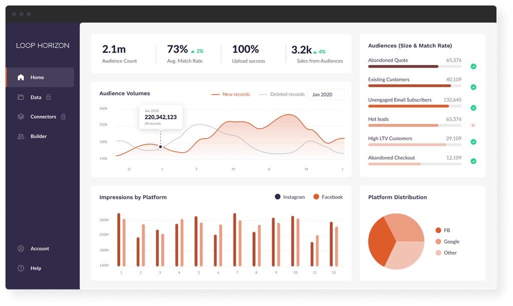
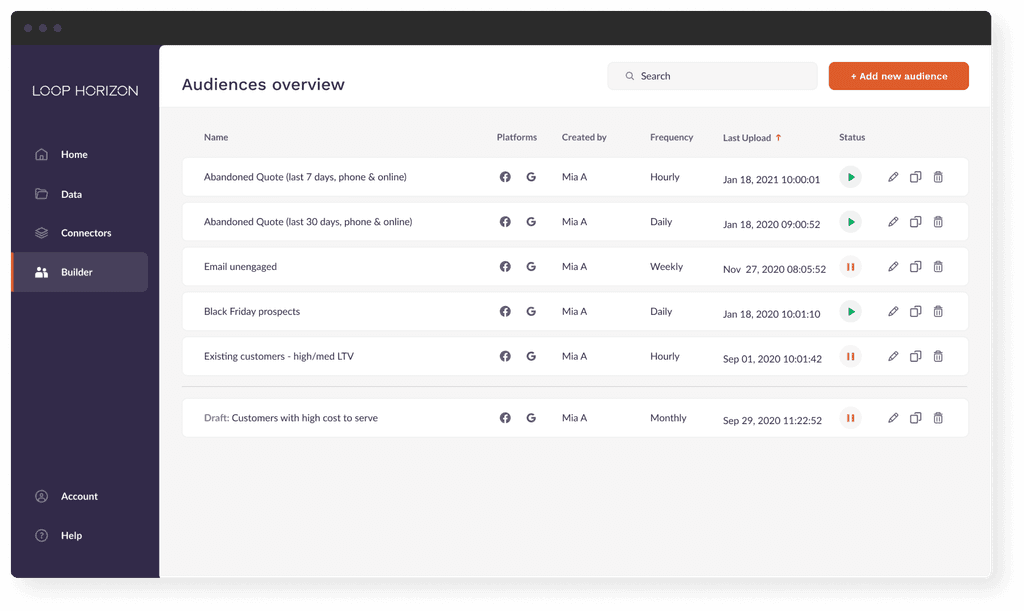
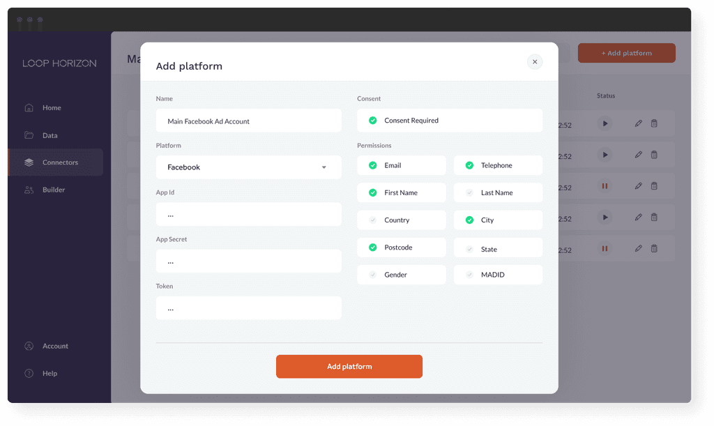
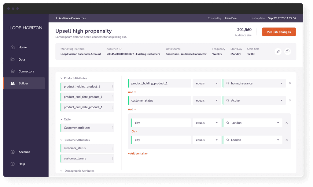
LoopHorizon is an example of one of a few B2B products I have worked on either as a sole Designer or Lead Designer.
LoopHorizon is an example of one of a few B2B products I have worked on either as a sole Designer or Lead Designer.
LoopHorizon is an example of one of a few B2B products I have worked on either as a sole Designer or Lead Designer.
ux & ui
2020
2020
2020


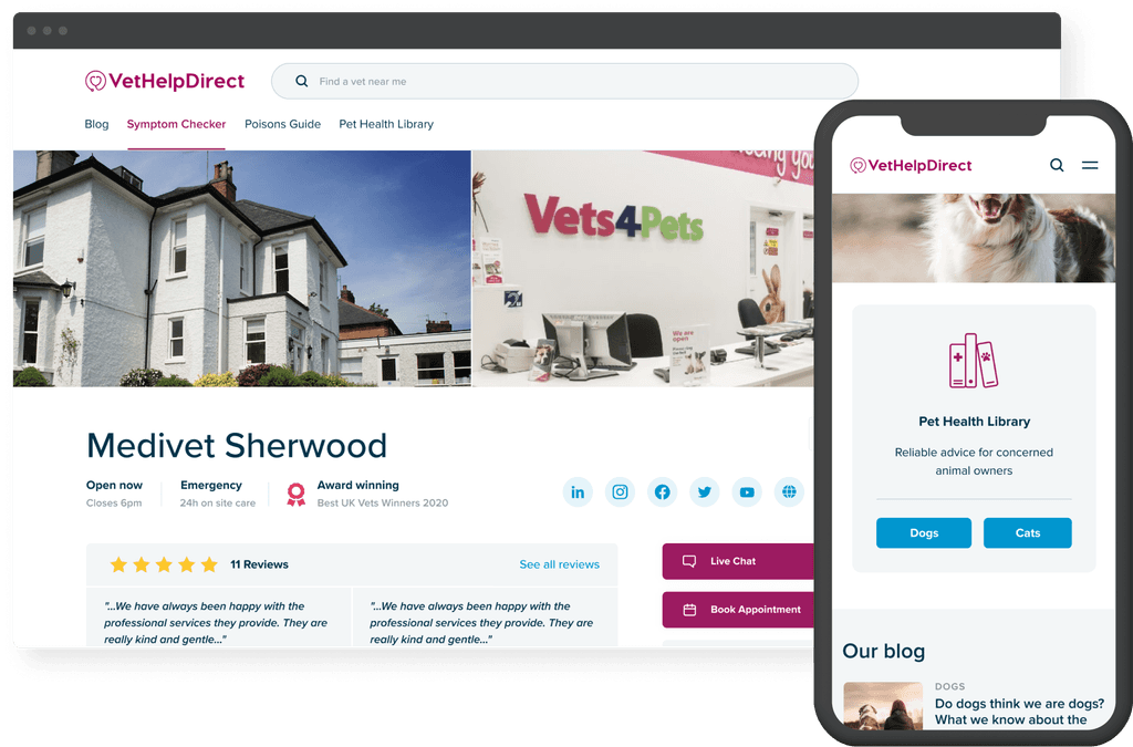
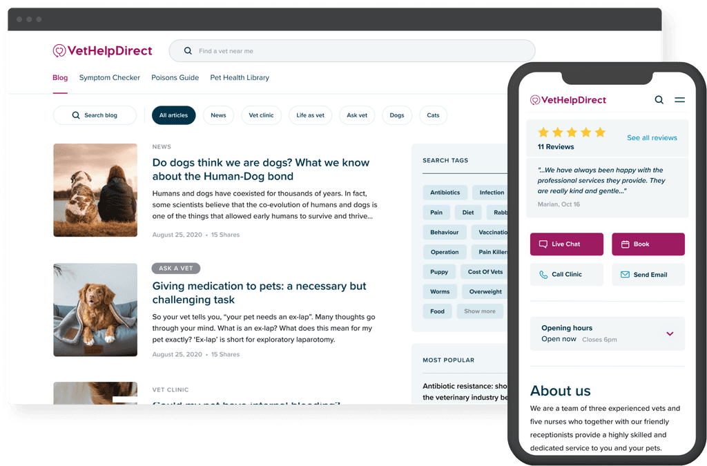
Vet Help Direct
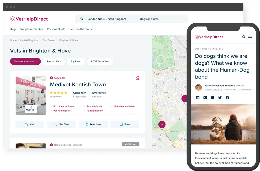
I redesigned the UX and UI of a popular UK vet directory and knowledge library, which receives millions of visitors per year. My contributions also resulted in a 50% increase in conversion rates and nearly doubled user traffic, thanks in large part to the strategic use of SEO elements.
I redesigned the UX and UI of a popular UK vet directory and knowledge library, which receives millions of visitors per year. My contributions also resulted in a 50% increase in conversion rates and nearly doubled user traffic, thanks in large part to the strategic use of SEO elements.
workshops
client interviews
badget & estimates
UX & UI
prototype
QA
2020
2020
2020


migrate
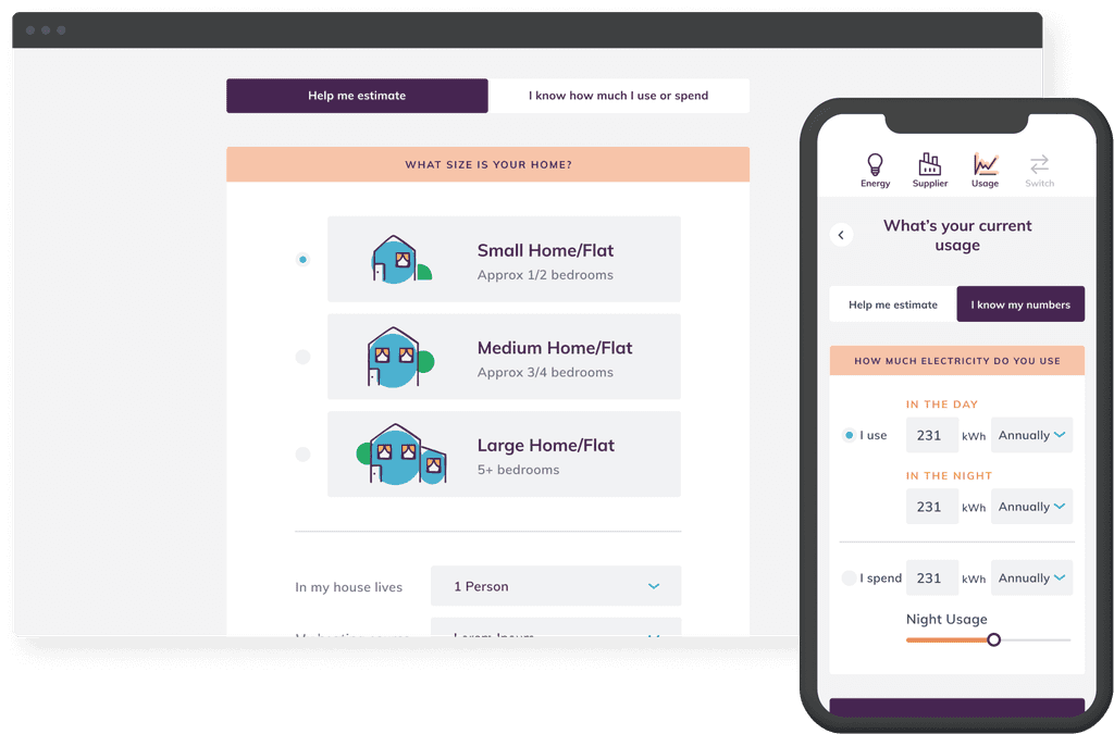
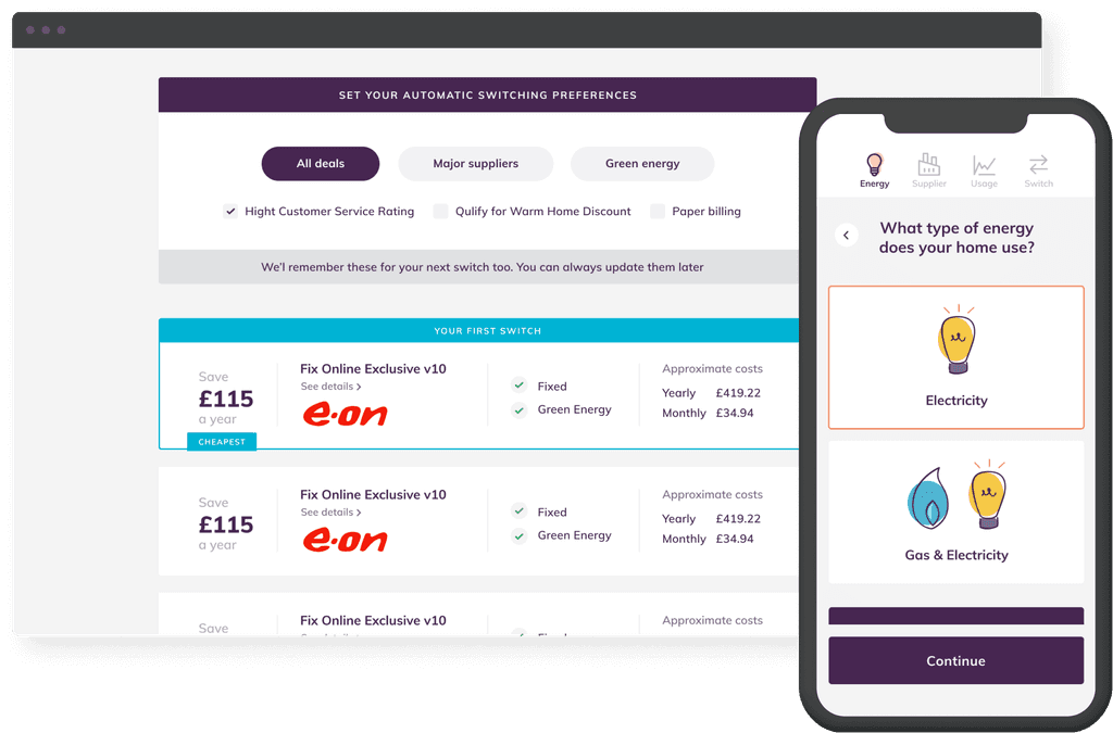
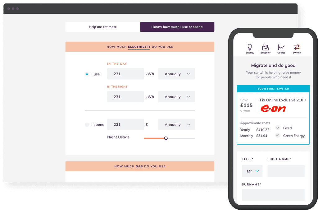
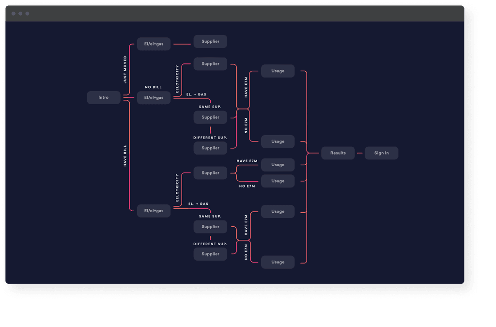
I was a lead designer for an energy-saving startup that was later acquired by one of the industry's biggest players. By simplifying a complex set of options, I helped make the product user-friendly, which was reflected in the glowing reviews it received from satisfied users.
I was a lead designer for an energy-saving startup that was later acquired by one of the industry's biggest players. By simplifying a complex set of options, I helped make the product user-friendly, which was reflected in the glowing reviews it received from satisfied users.
I was a lead designer for an energy-saving startup that was later acquired by one of the industry's biggest players. By simplifying a complex set of options, I helped make the product user-friendly, which was reflected in the glowing reviews it received from satisfied users.
workshops
Information Architecture
sitemaps
UX & UI
2019
2019
2019


gloves & glory
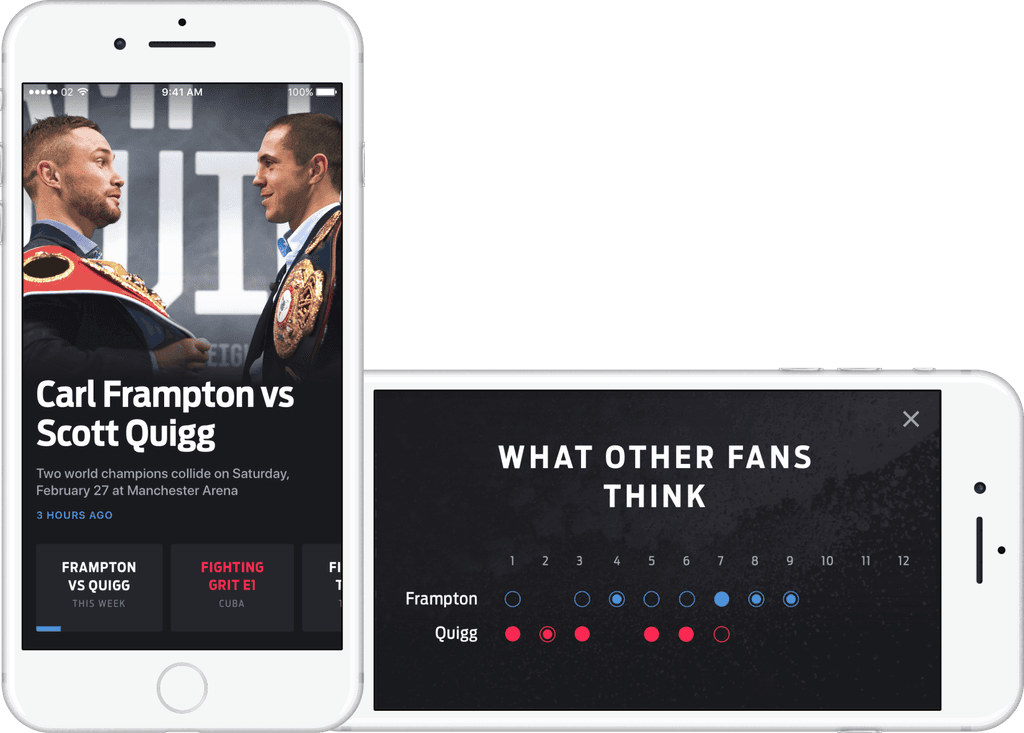
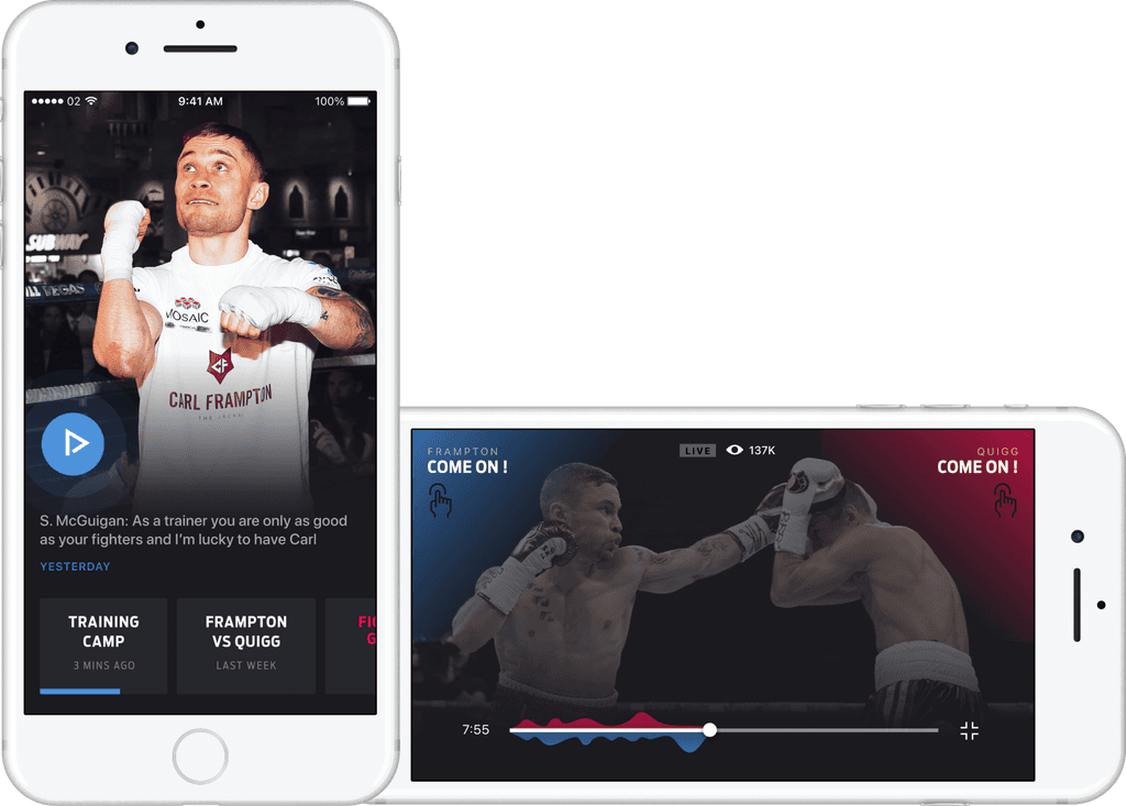
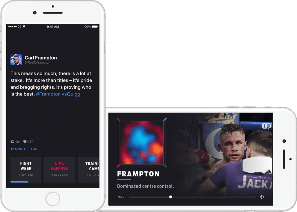
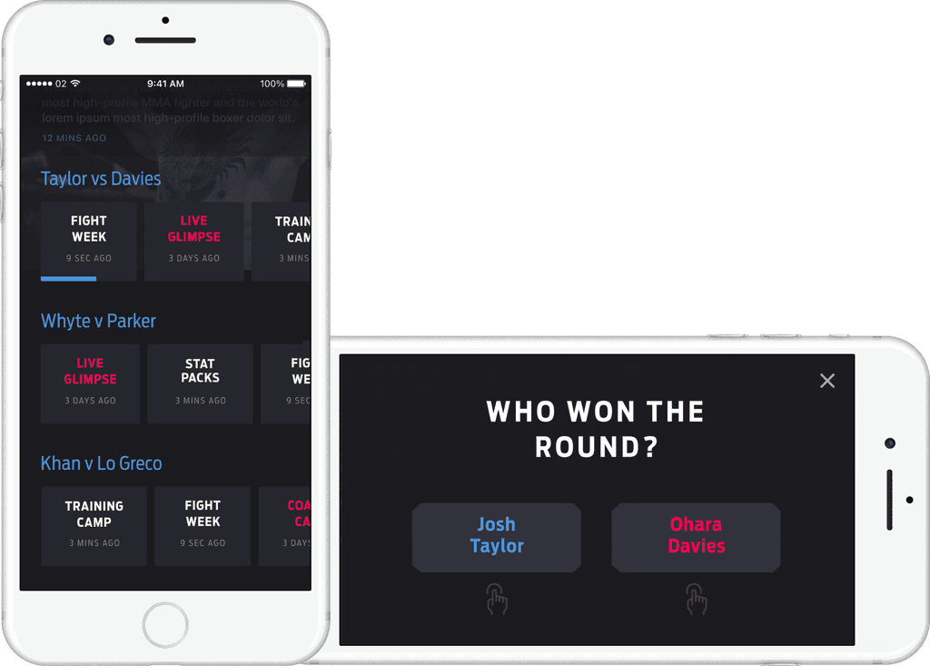
I conceptualised an app that lets boxing fans engage with the sport from the comfort of their couches, providing a fully immersive experience that simulates being ringside. To take things even further, we gave fans the unique option to act as the referee, allowing for an even deeper level of engagement.
I conceptualised an app that lets boxing fans engage with the sport from the comfort of their couches, providing a fully immersive experience that simulates being ringside. To take things even further, we gave fans the unique option to act as the referee, allowing for an even deeper level of engagement.
research
prove of concept
prototype
UX & UI
visual design
art direction
2018
2018
2018


tv graphics
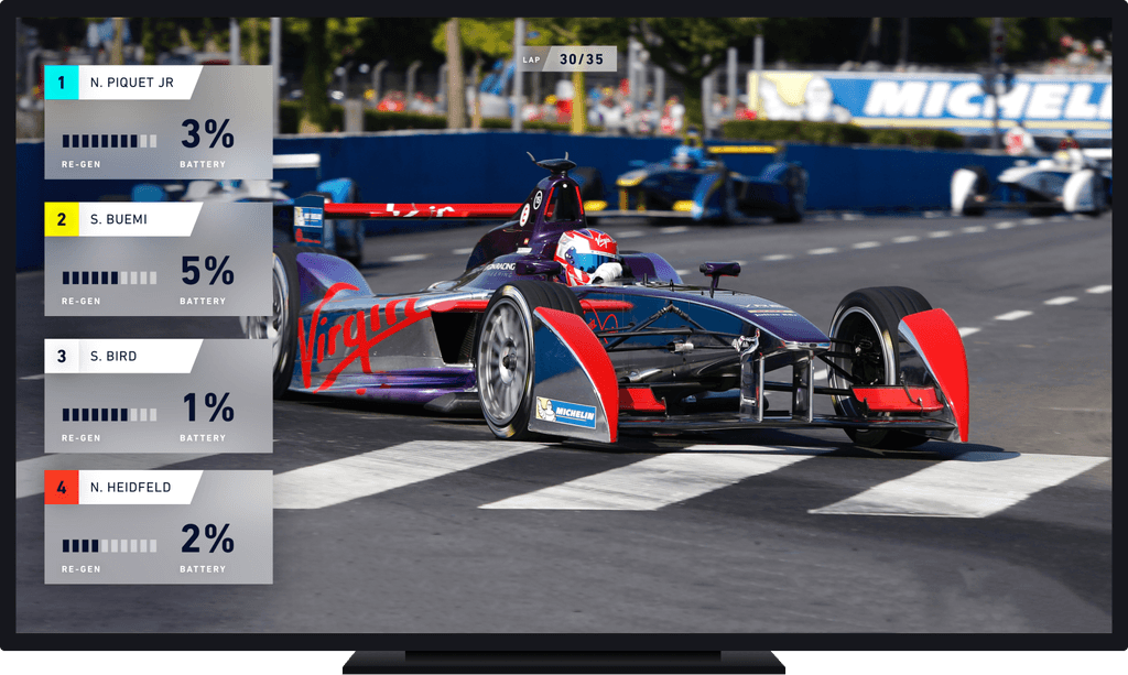
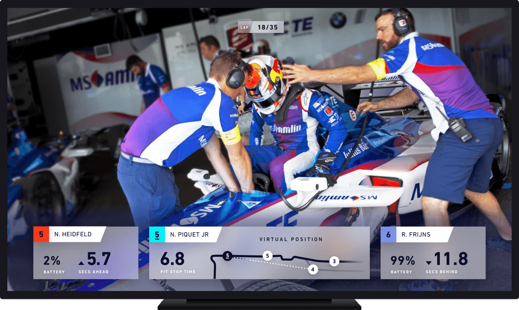
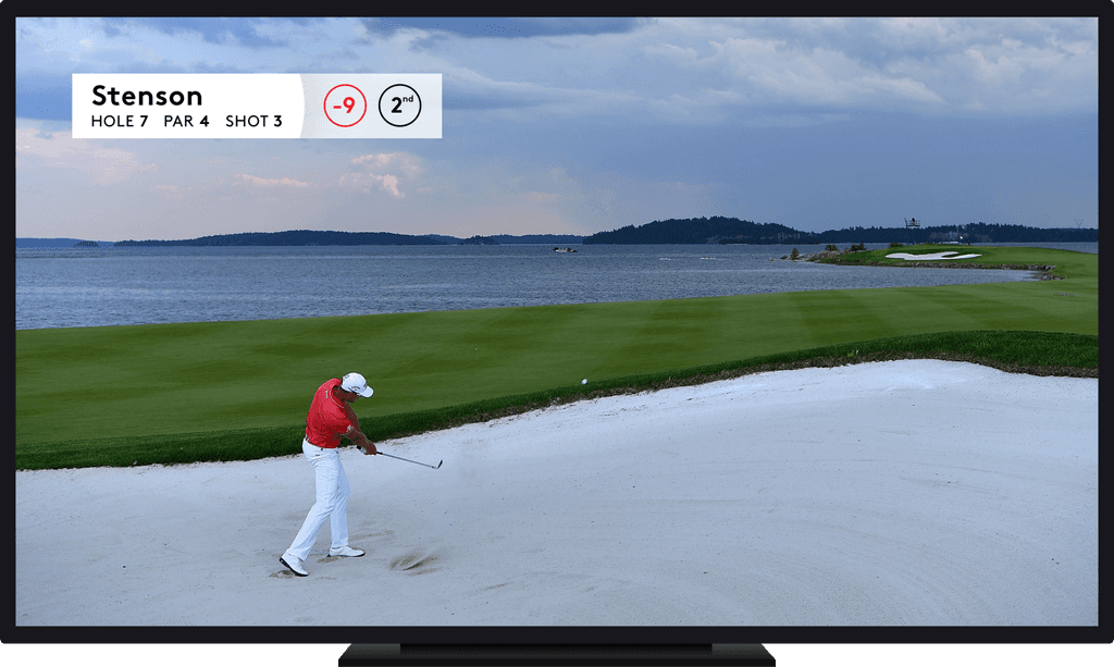
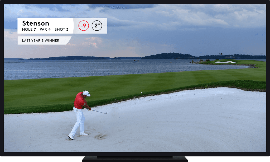
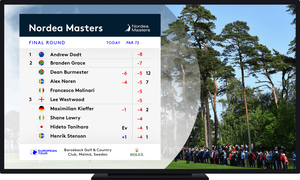
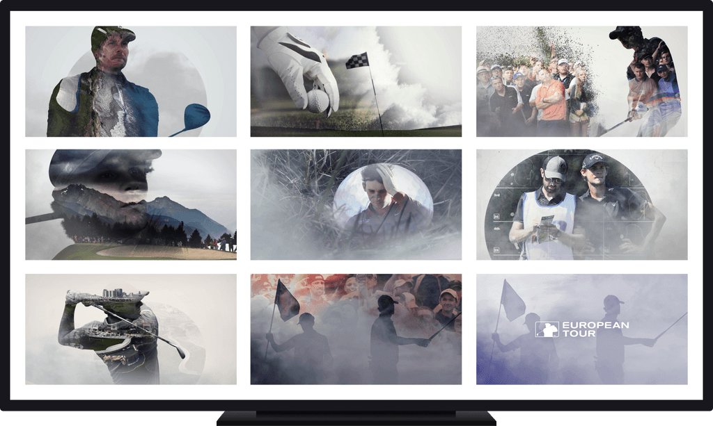
I was given the opportunity to push myself out of my comfort zone and dive into the world of TV graphics design, broadening my skill set and gaining valuable experience.
I was given the opportunity to push myself out of my comfort zone and dive into the world of TV graphics design, broadening my skill set and gaining valuable experience.
I was given the opportunity to push myself out of my comfort zone and dive into the world of TV graphics design, broadening my skill set and gaining valuable experience.
art direction
visual design
motion design
2017
2017
2017


2017
2017
2017
crowd cam
In just one week, I designed and prototyped an app concept based on an app brief that allows users to upload pictures from sports events.
In just one week, I designed and prototyped an app concept based on an app brief that allows users to upload pictures from sports events.
In just one week, I designed and prototyped an app concept based on an app brief that allows users to upload pictures from sports events.
clicable prototype
Motion UI
prove of concept
UX & UI
verizon microsite
verizon microsite
I was hired to work on Verizon’s signal coverage microsite. Within one week, I presented this low-fidelity but an interactive concept that emphasised the company's strengths while allowing users to check their coverage.
I was hired to work on Verizon’s signal coverage microsite. Within one week, I presented this low-fidelity but an interactive concept that emphasised the company's strengths while allowing users to check their coverage.
I was hired to work on Verizon’s signal coverage microsite. Within one week, I presented this low-fidelity but an interactive concept that emphasised the company's strengths while allowing users to check their coverage.
visual design
motion ui
2017
2017
2017
icon library
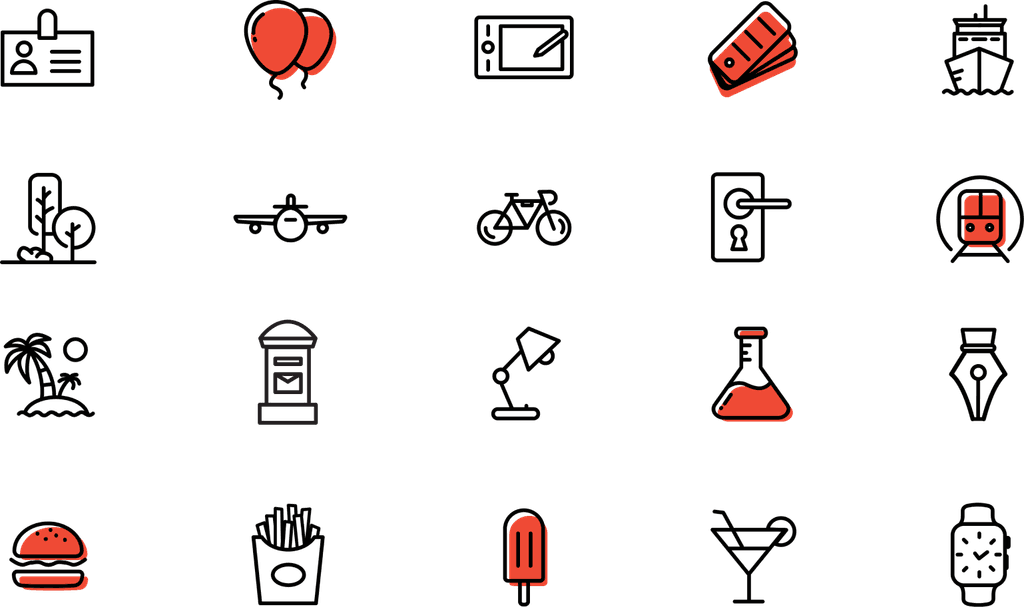
Designing icons with thick lines means there’s no room for details. Finding a distinctive shape of 100+ objects and drawing them using as few lines as possible was a great exercise.
Designing icons with thick lines means there’s no room for details. Finding a distinctive shape of 100+ objects and drawing them using as few lines as possible was a great exercise.
Designing icons with thick lines means there’s no room for details. Finding a distinctive shape of 100+ objects and drawing them using as few lines as possible was a great exercise.
2016
2016
2016


fiat professional
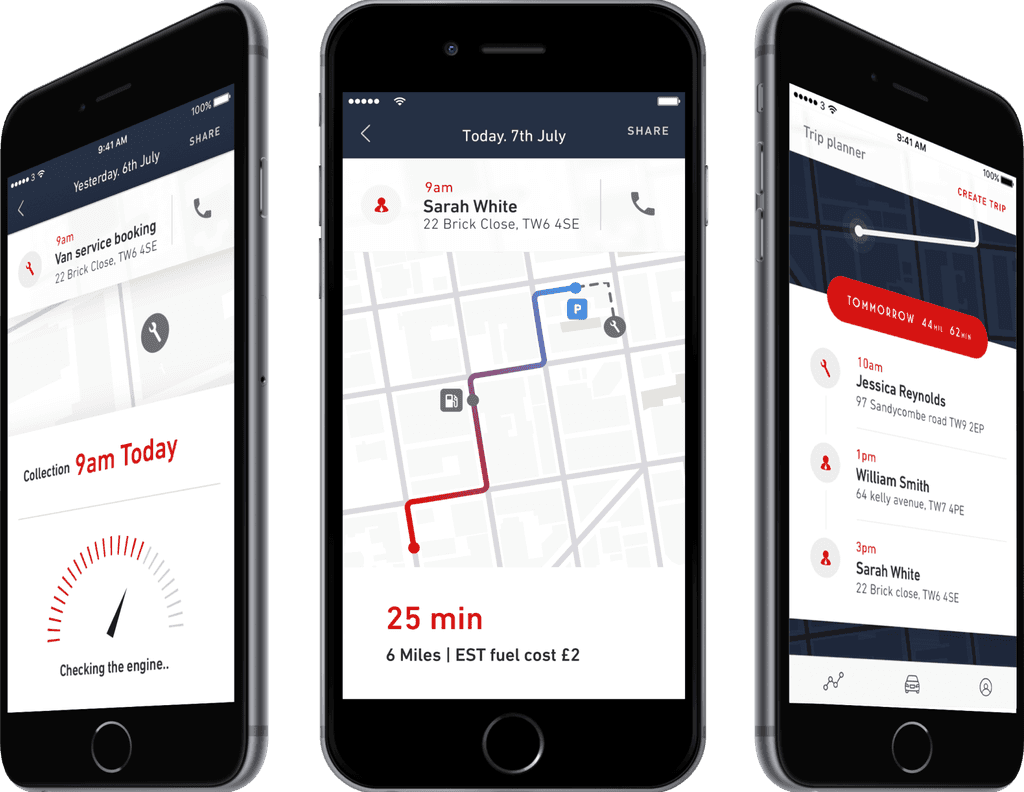
This app concept was designed for Fiat Professional drivers, providing them with a tool to manage delivery schedules and communicate with employees and customers.
This app concept was designed for Fiat Professional drivers, providing them with a tool to manage delivery schedules and communicate with employees and customers.
This app concept was designed for Fiat Professional drivers, providing them with a tool to manage delivery schedules and communicate with employees and customers.
visual design
prototype
2016
2016
2016


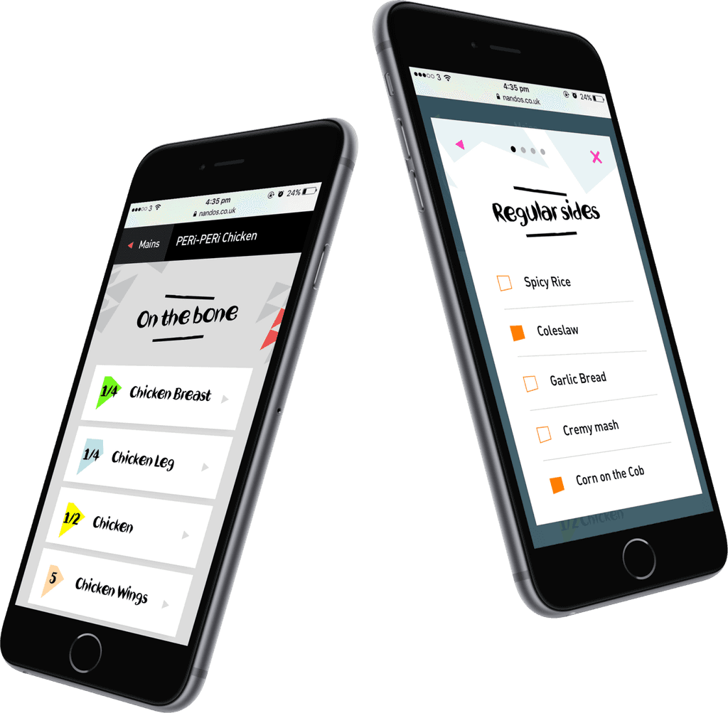
nando’s
When Nando's approached us to design their delivery service, I had a great time incorporating their bold brand elements into the design. However, following brand guidelines that were originally created for print media posed some challenges when it came to adapting them for digital use.
When Nando's approached us to design their delivery service, I had a great time incorporating their bold brand elements into the design. However, following brand guidelines that were originally created for print media posed some challenges when it came to adapting them for digital use.
When Nando's approached us to design their delivery service, I had a great time incorporating their bold brand elements into the design. However, following brand guidelines that were originally created for print media posed some challenges when it came to adapting them for digital use.
visual design
prototype
2016
2016
2016
